BRAND GUIDELINE · 2ND PROPOSAL
Same Justice — Logo
The reference for reproducing the Same Justice identity — logo construction and clearspace, the icon system, colour values for print and screen, and the trilingual (English · Arabic · Turkish) type system. Follow these specifications wherever the mark appears.
01Primary lockup
Option A
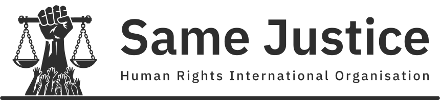
Solid charcoal mark and wordmark, scaled as one unit to sit inside the bar, mark size solved live so artwork height is exactly 0.24 × width, with the mark centered in the charcoal column and the space between “Same” and “Justice” centered on the 7/12 division. The underline, in the same charcoal as the mark and wordmark, keeps the 3 : 4 : 5 divisions of the construction.
Option B — legacy
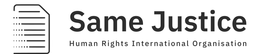
Legacy mark beside the wordmark and its line, all in solid charcoal, with no bar underneath. The mark keeps the height and position of Option A's, so the two options can be swapped without moving the wordmark.
02Iconography
Option A
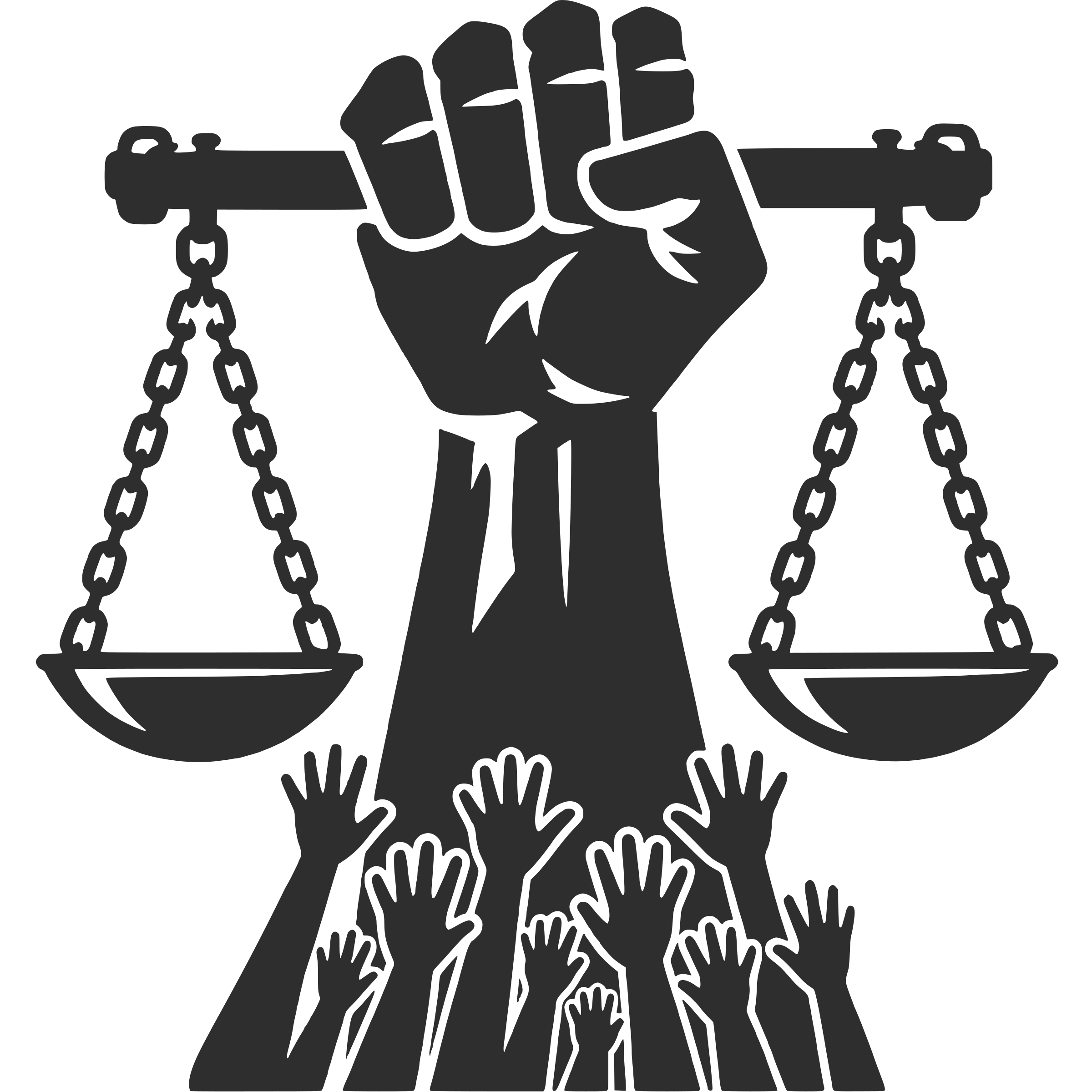
- Raised fist — solidarity and resolve, gripping the beam of the scales.
- Balanced scales — justice held level: beam, chains and twin pans drawn as one silhouette.
- Raised hands — the community of victims and witnesses the work stands on.
- Construction — square 1:1 silhouette, single colour, no gradients; clearspace x on all sides.
Icon-only use: the solid black mark alone. No wordmark, no bar.
Option B — legacy
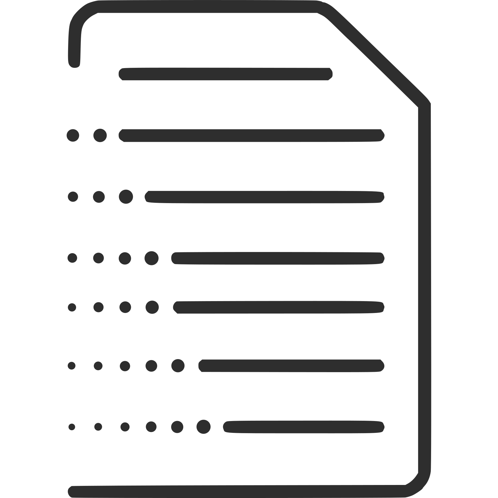
- Page — a document with a folded corner: the reports and records the work produces.
- Lines — the written record, each line ending in a full stroke.
- Dots — each line is led in by dots that grow towards it: documentation taking shape.
- Construction — single colour, outline drawing, no gradients; centred in its square frame, the same distance from every edge.
Icon-only use: the mark alone, in one colour. No wordmark, no bar.
02Supporting iconography
Interface and feature icons that support the mark — set exclusively in Phosphor Duotone.
Interface and supporting icons set exclusively in Phosphor Duotone (phosphoricons.com) — never Regular, Bold or Fill. Icons inherit the text colour (charcoal on light grounds) with the secondary tone in brand tan, sage or olive. Sizes: 24 px UI · 32 px feature · 48 px display.
03Clearspace & minimum size
Option A
2xxMinimum size
Never reproduce below these sizes; the bar and the scale chains are the first details to disappear.
Option B — legacy
xxxMinimum size
Never reproduce below these sizes; the smallest dots are the first details to disappear.
04Reversed & single-colour
Option A
Two safe fallbacks when full colour is unavailable. Do not invent other one-colour treatments (all-tan, all-olive, greyscale gradients).
04Reversed & single-colourcontinued
Option B — legacy
Two safe fallbacks when full colour is unavailable. Do not invent other one-colour treatments (all-tan, all-olive, greyscale gradients).
05Colours
IN USE · 6
- #739075
- #EAECDD
- #FFFFFF
- #2E2E2E
- #CA965C
- #45563D
Working grid: two rows of three, six colours. Final colours to be confirmed.
Values & reproduction
| Role | HEX | RGB | CMYK (coated) |
|---|---|---|---|
| Charcoal — main ground, ink on pale sage | #2E2E2E | 46 · 46 · 46 | 0 · 0 · 0 · 82 |
| Tan — accent | #CA965C | 202 · 150 · 92 | 0 · 26 · 54 · 21 |
| Olive — accent | #45563D | 69 · 86 · 61 | 20 · 0 · 29 · 66 |
| Sage — supporting | #739075 | 115 · 144 · 117 | 20 · 0 · 19 · 44 |
| Pale sage — secondary ground, text on charcoal | #EAECDD | 234 · 236 · 221 | 1 · 0 · 6 · 7 |
| White — reversed marks | #FFFFFF | 255 · 255 · 255 | 0 · 0 · 0 · 0 |
CMYK values are conversions for confirmation, not measured Pantone references. Confirm a spot colour for tan and olive before any offset print run.
05Colourscontinued
Proportion in use
Dominant pale sage and charcoal carry the system; tan, olive and sage stay accents — never large fills. Roughly 60 / 30 / 10 across ground, ink and accent.
06Typography & calligraphy
| Primary | IBM Plex Sans — the voice. Strong, civic, assertive. Headlines, navigation, buttons. Latin sets in IBM Plex Sans and Arabic in its companion IBM Plex Sans Arabic — one design system, two scripts. |
|---|---|
| Secondary | Noto Sans Arabic — the workhorse. Neutral, highly readable. Body text, reports and long-form. Latin, Arabic and Turkish. |
| Language coverage | English, Arabic and Turkish are all covered, including the Turkish letters ğ ş İ ı. Turkish sets in IBM Plex Sans alongside English with no fallback substitution. |
PRIMARY · IBM PLEX SANS · HEADLINES
AaBbCc Ğğ Şş 0123
| Documented, verified, published. | Regular 400 |
| Documented, verified, published. | Medium 500 |
| Documented, verified, published. | SemiBold 600 |
| Documented, verified, published. | Bold 700 |
Justice, documented.
Adalet, belgelendi. — Ağır ihlaller, bağımsız değerlendirme.
العدالة للجميع
06Typography & calligraphycontinued
SECONDARY · NOTO SANS ARABIC · BODY & LONG-FORM
AaBbCc Ğğ Şş 0123
Every claim is checked against primary sources before it is published. Names, dates and places are verified twice; anything uncertain is marked as such. This is the discipline the reporting system is built on.
العدالة حق للجميع، والتوثيق الدقيق هو خطوتها الأولى. كل ادعاء يُتحقق منه، وكل اسم وتاريخ يُراجع قبل النشر.
Arabic and Turkish specimens are illustrative samples of each face, not official translations. Buttons and navigation may set in either face; body and long-form always set in Noto Sans Arabic. Turkish sets in the same two faces — both include ğ, ş and dotted/dotless İ/ı.
07Proportions
| Lockup | Mark square 1:1, size solved live (≈214), centered in charcoal column · word gap centered on the 7/12 division · artwork height = 0.24 × width · lockup shown at 84% |
|---|---|
| Bar | Full block width, 8 tall, round ends, touching the row (zero offset), thirds weighted 3 : 4 : 5 |
| Clearspace | x on all sides of the icon, where x equals the frame padding |
08Usage
- Use on pale sage or very light backgrounds.
- Minimum widths: full lockup 30 mm print / 120 px screen · icon 10 mm / 40 px.
- Do not recolour, rotate, outline or rearrange the elements.
- Single-colour reproduction (fax, engraving): black bar, all-black lockup.
09Misuse
Option A
Same JusticeOption B — legacy
Same Justice17 King Edwards Road
Ruislip, London, HA4 7AE
United Kingdom